Before To Read
- Check your browser and check property that is possible to use in your browser on caniuse.com.

Chapter 0 : About This Book
Javascript Coding type
function $$(selector, context) {
context = context || document;
var elements = context.querySelectorAll(selector);
return Array.prototype.slice.call(elements);
}
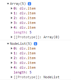
console.log($$(".item"));
console.log(document.querySelectorAll(".item"));-
return Array.prototype.slice.call(elements);can be replaced byreturn [...elements];. -
$$(".item")returns Array, butdocument.querySelectorAll(".item")returns NodeList.
Chapter 1: Introduction
Css Coding Tips
Minimize Code Duplication
- Minimizing the amount of edits necessary to make a change.
- When values depend on font size, try to reflect their relationship in the code.
button {
    padding: 6px 16px;
    border: 1px solid #446d88;
    background: #58a linear-gradient(#77a0bb, #58a);
    border-radius: 4px;
    box-shadow: 0 1px 5px gray;
    color: white;
    text-shadow: 0 -1px 1px #335166;
    font-size: 20px;
    line-height: 30px;
}
- There are several issues with the maintainability of this code that we can fix.
- Now if I change the parent font size to 40px, the button will instantly become bigger. However, it will look quite different, because all other effects were designed for a smaller button and did not scale.
button {
    padding: .3em .8em;
    border: 1px solid rgba(0, 0, 0, .1);
    background: #58a linear-gradient(hsla(0, 0%, 100%, .2), transparent);
    border-radius: .2em;
    box-shadow: 0 .05em .25em rgba(0, 0, 0, .5);
    color: white;
    text-shadow: 0 -.05em .05em rgba(0, 0, 0, .5);
    font-size: 125%;
    line-height: 1.5;
}- To calculate
pxtoem, multiple 1/(2*10) to the original value. - Basic font size of
htmltag is 16px. - With this, you can make other buttons easily.
button.cancel {
    background-color: #c00;
}

button.ok{
    background-color: #6b0;
}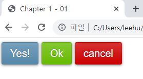
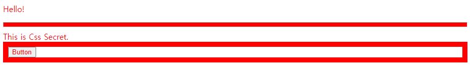
- Maintainability versus brevity
- When you want to except only one property, then, first, make it all same, and second, make an except.
/*Dont't border-width: 10px 10px 10px 0;*/
border-width: 10px;
border-left-width: 0;- currentColor
- You can use
currentColorlike other colors, for example white, red or black.
- You can use
body {
    color: red;
}

.foo {
    border-style: solid;
    border-width: 10px;
}

button {
    color: currentColor;
}

hr {
    height: .5em;
    background: currentColor;
}
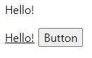
- inherit
-
inheritfollows parent’s property.
-
a, button {
    font: inherit;
    color: inherit;
}
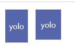
Trust your eyes, not numbers
- Optical illusions are very common in any form of visual design.
- Letterforms are much more straight on the sides than their top and bottom. We need to specify less padding for the top and bottom sides.
body {
    margin: 0;
}

.row {
    display: flex;
}

.square {
    margin: 0 10px;
    width: 100px;
    height: 400px;
    background-color: yellow;
}

.inner-square {
    position: absolute;
    width: 30px;
    height: 30px;
    background-color: gray;
}

.left > .inner-square {
    top: 185px;
    left: 45px;
}

.right > .inner-square {
    top: 180px;
    left: 165px;
}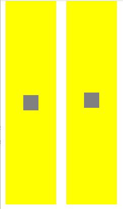
.row {
    display: flex;
    align-items: flex-start;
    align-content: flex-start;
}

.yolo {
    margin: .5em;
    background-color: #56a;
    color: white;
}

.left {
    padding: .5em;
}

.right {
    padding: .3em .7em;
}
On Responsive Web Design
- Use percentages instead of fixed witdhs. When that’s not possible, use viewport-relative units(vm, vh, vmin, vmax), which resolve to a fraction of the viewport width or height.
- When you want a fixed width for larger resolutions, use
max-width, not width, so it can still adapt to smaller ones without media queries.
div {
    width: 600px;
    background: pink;
}
div {
    max-width: 600px;
    background: pink;
}
- Don’t forget to set a max-width of 100% for replaced elements such as
img,object,videoandiframe.
img {
    max-width: 100%;
}

.full-img {
    width: 100%;
}- In cases when a background image needs to cover an entire container,
background-size: covercan help maintain that regardless of said container’s size. However, bear in mind that bandwidth is not unlimited, and it’s not always wise to include large images that are going to be scaled down via CSS in mobile designs. - When laying out images(or other elements) in a grid or rows and columns, let the number of columns be dictated by the viewport width. Flexible Box Layout(a.k.a Flexbox) or
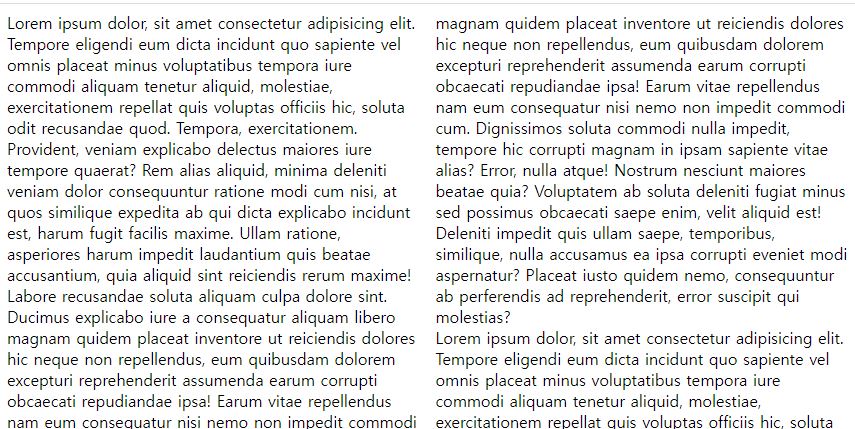
display: inline-blockand regular text wrapping can help with that. - When using multi-column text, specify
column-widthinstead ofcolumn-count, so that you get one column only in small resolutions.
.container {
    column-count: 5;
}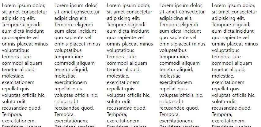
.container {
    column-width: 300px;
}
Use Shorthands Wisely
- It is good defensive coding and future-proofing to use them, unless we intentionally want to use cascaded properties.
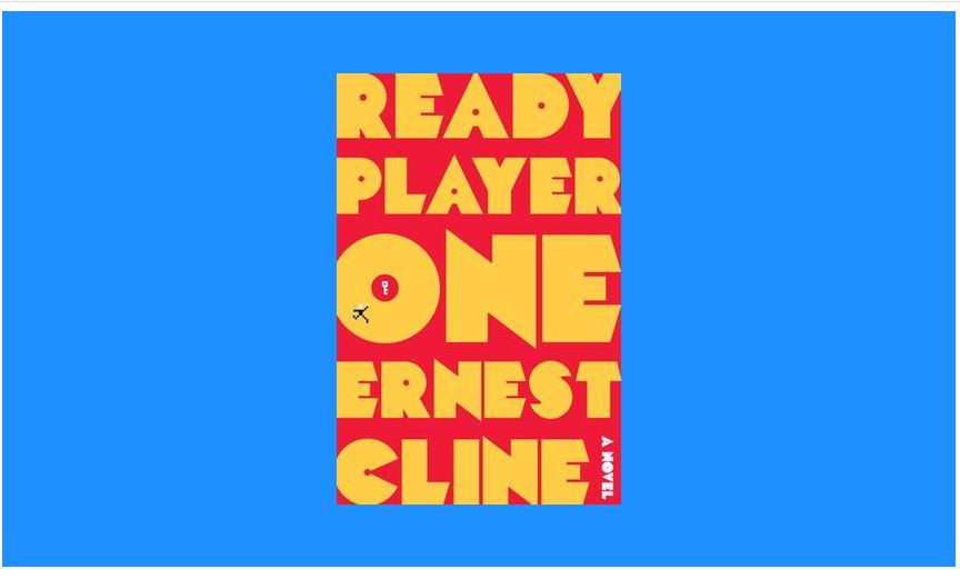
.before {
height: 500px;
background-image: url("https://upload.wikimedia.org/wikipedia/en/a/a4/Ready_Player_One_cover.jpg");
background-repeat: no-repeat;
background-position: 50% 50%;
background-color: dodgerblue;
}
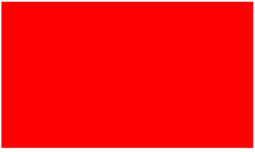
.after {
background: red;
}
- If only one valule is provided, it is expanded to apply to every item in the list, then we can take advantage of CSS list expansion rules.
background: url(tr.png) no-repeat top right / 2em 2em,
            url(br.png) no-repeat bottom right / 2em 2em,
url(bl.png) no-repeat bottom left / 2em 2em;background: url(tr.png) top right,
url(br.png) bottom right,
url(bl.png) bottom left;
background-size: 2em 2em;
background-repeat: no-repeat;Should I use a preprocessor?
- LESS, Sass or Stylus
- Debugging becomes harder.
- We are restricted in our choice of collaborators or need to spend extra time for training.
- They have their own bugs.
- Many preprocessor-inspired fetures have been making their way into pure CSS.
-
But, used properly, they can help keep code more flexible in a large project.
- variable and function in CSS
- Native CSS
calc()has no trouble. -
--sets a variable. Andvar()returns a value of the variable.
- Native CSS
ul { --accent-color: purple; }
ol { --accent-color: rebeccapurple; }
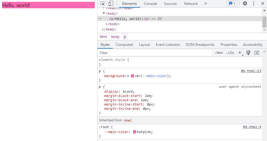
li { background: var(--accent-color); }:root {
--main-color: hotpink;
}
p {
background: var(--main-color);
}
- Weird shorthand syntax
- Using a slash(/) to separate background-position on left and background-size on right.
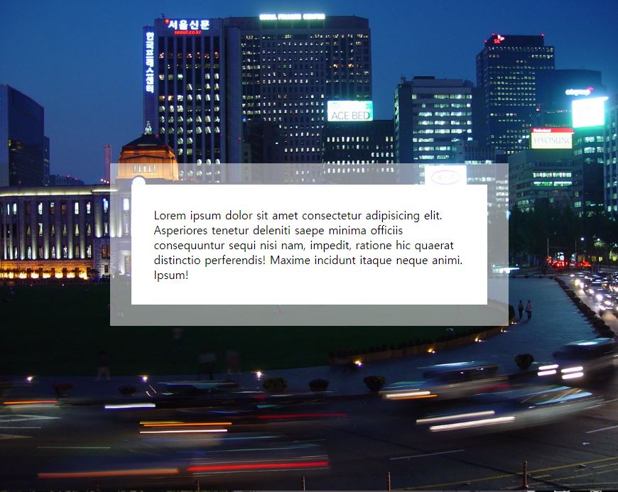
background: url(images/foo.jpg) no-repeat 50% 50% / 50% 50%;Backgrounds & Borders
Translucent borders
- Background covers even border.
- But
background-clipsets background area.
body {
    display: flex;
    justify-content: center;
    align-items: center;
    min-height: 100%;
    background: url("https://images.freeimages.com/images/large-previews/eb7/seoul-plaza-south-korea-2-1447086.jpg") no-repeat 0 0 / cover;
    margin: 0;
}

.box {
    width: 50%;
    padding: 2rem;
    border: 30px solid rgba(255, 255, 255, 0.5);
    background: white;
    background-clip: padding-box;
}
Chapter 8: Transitions & Animations
Elastic Transitions
- What is Transition?
-
transitionchanges property in specific time.
-
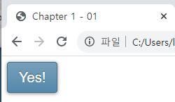
button {
    padding: 1rem;
    font-size: 3rem;
    color: white;
    background-color: green;
    transition: all 0.5s;
}

button:hover {
    padding: 2rem;
    background: red;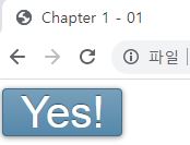
}- What is Animation?
-
animationchanges property with frames.
-
@keyframes foo {
    50% { width: 600px; }
    75% { width: 100px; background: blue; }
}

button {
    width: 200px;
    padding: 1rem;
    font-size: 3rem;
    color: white;
    background-color: green;
    animation: foo 1s infinite;
}

button:hover {
    padding: 2rem;
    background: red;
}
Bouncing Animations
body { margin: 0; }

@keyframes bounce {
    60%, 80%, to { transform: translateY(350px); }

    70% { transform:  translateY(250px); }

    90% { transform: translateY(300px); }
}

.ball {
    position: absolute;
    left: 50%;
    top: 0;
    width: 60px;
    height: 60px;
    margin-left: -20px;
    border-radius: 50%;
    background: red;
    animation: bounce 3s infinite;
}

.floor {
    position: absolute;
    left: 0;
    top: 410px;
    width: 100%;
    height: 5px;
    background: black;
}-
This animation is so unnatural. The reason is that its
timing functionis the same across all these keyframes. -
timing function
-
ease-in: slower -
ease-out: faster -
ease-in-out: slower and then faster -
linear: same speed
-
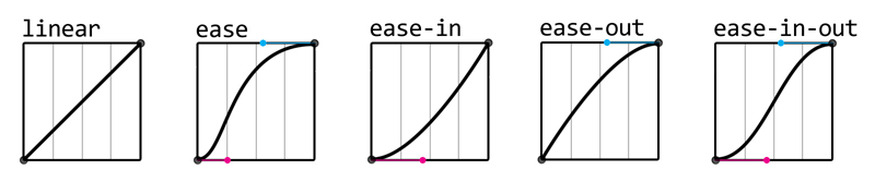
- Moreover, with
cubic-bezier, we can reverse any timing function by swapping the horizontal with the vertical coordinates for both its control points.
body { margin: 0; }

@keyframes bounce {
    60%, 80%, to {
        transform: translateY(350px);
        animation-timing-function: cubic-bezier(.15, .29, .29, .75);
    }

    70% { transform:  translateY(250px); }

    90% { transform: translateY(300px); }
}

.ball {
    position: absolute;
    left: 50%;
    top: 0;
    width: 60px;
    height: 60px;
    margin-left: -20px;
    border-radius: 50%;
    background: red;
    animation: bounce 1s cubic-bezier(.29, .15, .75, .29) forwards;
}

.floor {
    position: absolute;
    left: 0;
    top: 410px;
    width: 100%;
    height: 5px;
    background: black;
}
Elastic Transitions
- You can make elastic transition with animation, but honestly, transition is easier.
body { margin: 0; }

input:not(:focus) + .callout {
    transform: scale(0);
    transition: .25s;
}

.callout {
    display: block;
    background: salmon;
    transition: .5s cubic-bezier(.25, .1, .3, 1.5);
    transform-origin: 1.4em -.4em;
}-
input:not(:focus) + .callout, this menas, when we don’t focus on input box, set properties of callout class which is neighbor with input.
-
Additionaly, if you have color change, then add
transformattransition. -
Why duration is in original?
- Because, normally, we want to set same duration at fade-in and fade-out.
- So
input:hover { transform: scale(2); transition 1s; }has only 1s fade-in, no fade-out.
Frame-By-Frame Animations
- Why should we stop to use gif?
- They cannot have alpha transparency.
- This is for portability, but not for experimentation.
body { margin: 0; font-size: 2rem; }

@keyframes no-look {
    100% { background-position: -1800px 0; }
    }

.no-look {
    overflow: hidden;
    width: 180px;
    height: 180px;
    background: url('img/mc_nolook_sample.png') no-repeat 0 0;
    background-size: 1800px 180px;
    animation: no-look .75s infinite steps(10);
}-
stepsdivides the whole animation in frames and abruptly swithes between them.
Blinking
-
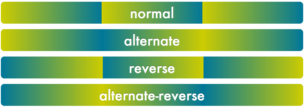
animation-directionchanges animation process withnormal,alternate,reverse,alternate-reverse.
- Smoothly Blinking
body { margin: 0; font-size: 2rem; }

@keyframes blink-smooth {
    100% {
        color: transparent;
    }
}

.highlight {
    animation: blink-smooth .5s 6 alternate;
}- Use alternate, and make time to half and twice the loop.
- Classic Blinking
body { margin: 0; font-size: 2rem; }

@keyframes blink {
    50% {
        color: transparent;
    }
}

.highlight {
    animation: blink 0.2s infinite steps(1);
}- Use step and make a frame on 50%.
Typing Animation
-
Please use this animation only one line!
- ch
- In monospace fonts, the width of the “0” glyph is the same as width of every glyph.
-
chis a degree of width of the “0” glyph.
- window.onload
- When you want to write javascript on header and need an elements of body, you have to wait until html is readed.
-
window.onloadis an event to wait reading all html document. - But, you don’t need to write this when you type code in the body.
- querySelector vs querySelectorAll
-
querySelectorgets only one element of selector andquerySelectorAllgets all elements of selector.
-
body { margin: 0; font-size: 2rem; }

@keyframes typing {
    from { width: 0; }
}

@keyframes caret {
    50% { border-color: currentColor;}
}

h1 {
    font-family: 'Courier New', Courier, monospace;
    width: 15ch;
    border-right: 0.05em solid transparent;
    white-space: nowrap;
    overflow: hidden;
    animation: typing 2s steps(15), caret 1s steps(1) infinite;
}
var h1Elem = document.querySelectorAll('h1');
h1Elem.forEach(function(h1) {
var len = h1.textContent.length;
h1.style.width = len + 'ch';
h1.style.animationTimingFunction = 'steps(' + len + '), steps(1)';
});Smooth State Animations
html, body {
    margin: 0;
    padding: 0;
    border: 0;
}

html {
    height: 100%;
}

@keyframes panoramic {
    to { background-position: 100% 0; }
}

.panoramic {
    width: 300px;
    height: 600px;
    background: url('https://previews.123rf.com/images/whiteisthecolor/whiteisthecolor1309/whiteisthecolor130900008/22975724-blue-horizontal-lines-pattern-contemporary-world-map.jpg') no-repeat 0 0;
    background-size: auto 100%;
    animation: panoramic 10s linear infinite alternate;
    animation-play-state: paused;
}

.panoramic:hover {
    animation-play-state: running;
}
Animation Along A Circular Path
- When you change only base point of the animation.
html, body {
    margin: 0;
    padding: 0;
    border: 0;
}

html {
    height: 100%;
}

body {
    display: flex;
    justify-content: center;
    align-items: center;
    height: 100%;
}

@keyframes spin {
    to { transform: rotate(1turn); }
}

.path {
    width: 300px;
    height: 300px;
    border-radius: 50%;
    text-align: center;
    background: gold;
}

.avatar {
    width: 50px;
    animation: spin 3s infinite linear;
    transform-origin: 50% 150px;
}- When image spin too with reverse direction.
html, body {
    margin: 0;
    padding: 0;
    border: 0;
}

html {
    height: 100%;
}

body {
    display: flex;
    justify-content: center;
    align-items: center;
    height: 100%;
}

@keyframes spin {
    to { transform: rotate(1turn); }
}

.path {
    width: 300px;
    height: 300px;
    border-radius: 50%;
    text-align: center;
    background: gold;
}

.avatar {
    animation: spin 3s infinite linear;
    transform-origin: 50% 150px;
}

.avatar img {
    width: 50px;
    animation: inherit;
    animation-direction: reverse;
}- When you use only one element for image.
  html, body {
    margin: 0;
    padding: 0;
    border: 0;
}

html {
    height: 100%;
}

body {
    display: flex;
    justify-content: center;
    align-items: center;
    height: 100%;
}

@keyframes spin {
    from {
        transform: rotate(0turn)
                    translateY(-150px)
                    translateY(50%)
                    rotate(1turn);
    }

    to {
        transform: rotate(1turn)
                    translateY(-150px)
                    translateY(50%)
                    rotate(0turn);
    }
}

.path {
    width: 300px;
    height: 300px;
    border-radius: 50%;
    text-align: center;
    background: gold;
}

.avatar {
    display: block;
    width: 50px;
    margin: calc(50% - 25px) auto 0;
    animation: spin 3s infinite linear;
}