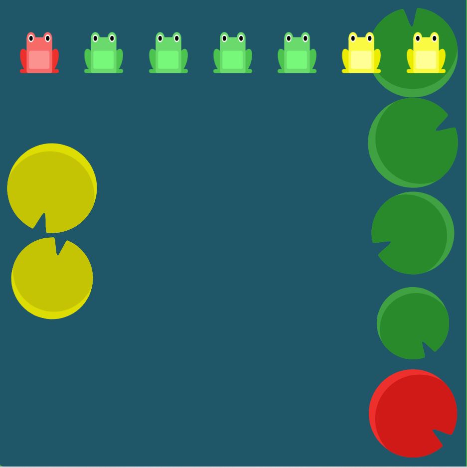
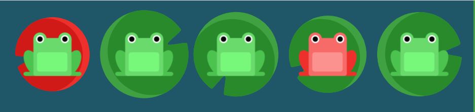
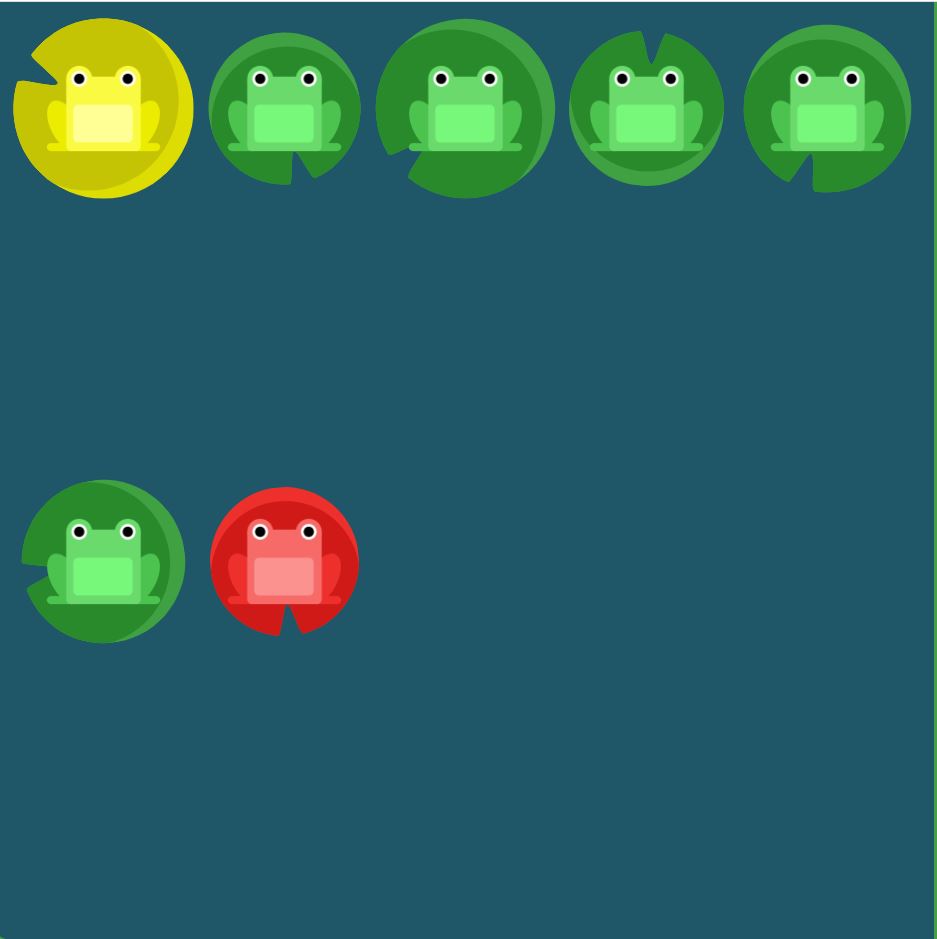
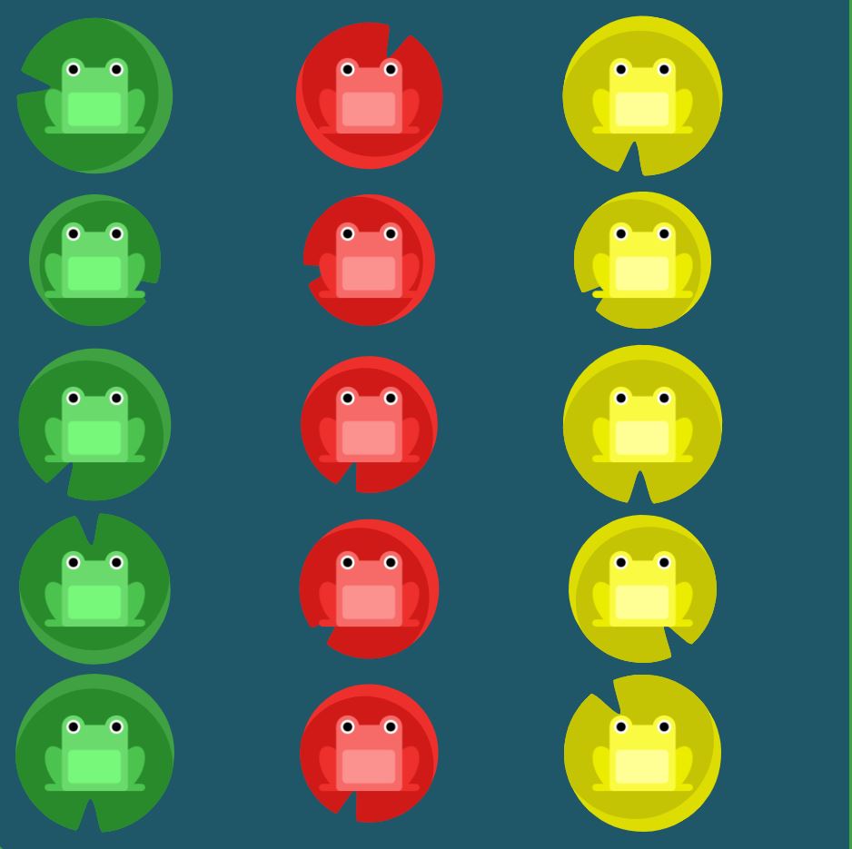
justify-content
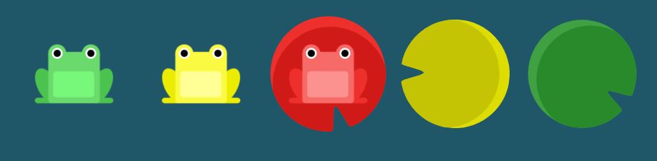
Elements
- flex-start: Items align to the left side of the container.
- flex-end: Items align to the right side of the container.
- center: Items align at the center of the container.
- space-between: Items display with equal spacing between them.
- space-around: Items display with equal spacing around them.
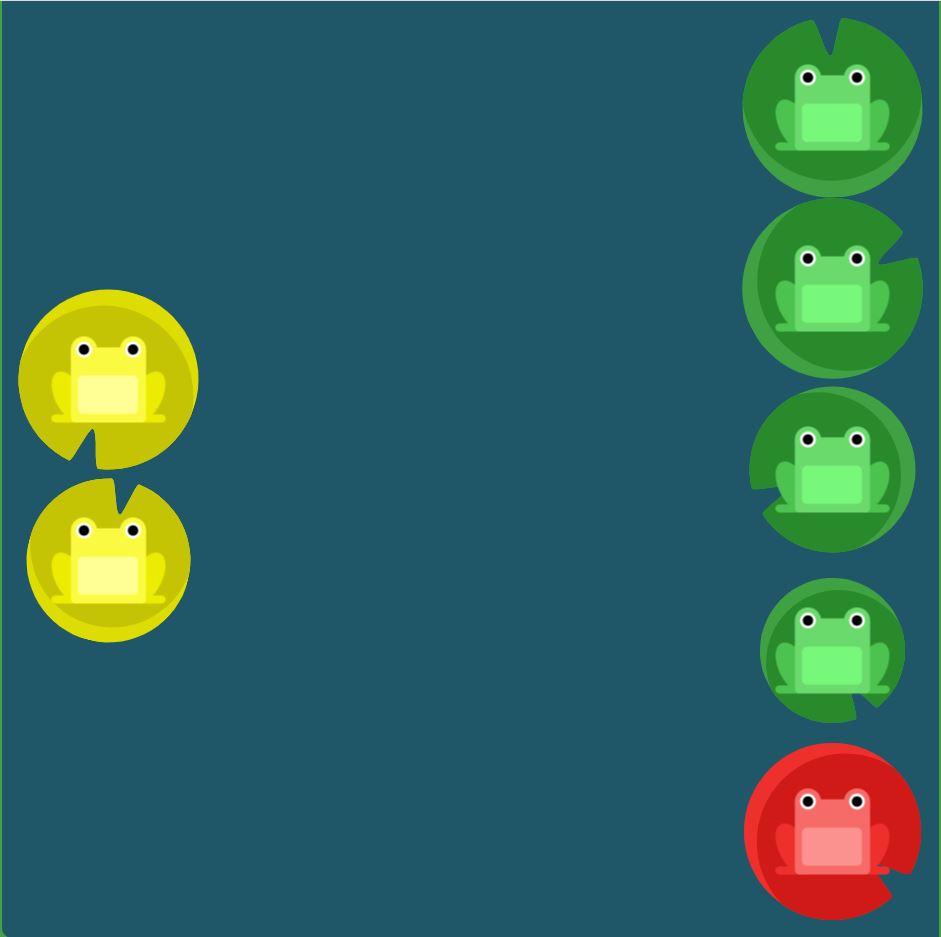
Solution
#pond {
  display: flex;
  justify-content: flex-end;
}

#pond {
  display: flex;
  justify-content: center;
}

#pond {
  display: flex;
  justify-content: space-around;
}

#pond {
  display: flex;
  justify-content: space-between;
}

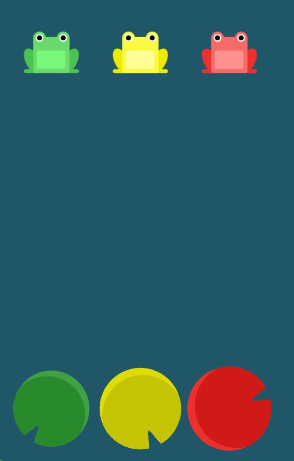
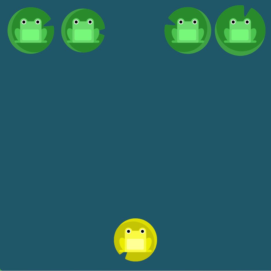
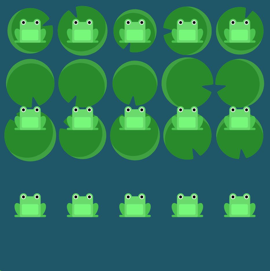
align-items
Elements
- flex-start: Items align to the top of the container.
- flex-end: Items align to the bottom of the container.
- center: Items align at the vertical center of the container.
- baseline: Items display at the baseline of the container.
- stretch: Items are stretched to fit the container.
Solutions
#pond {
  display: flex;
  align-items: flex-end;
}

#pond {
  display: flex;
  justify-content: center;
  align-items: center;
}

#pond {
  display: flex;
  justify-content: space-around;
  align-items: flex-end;
}

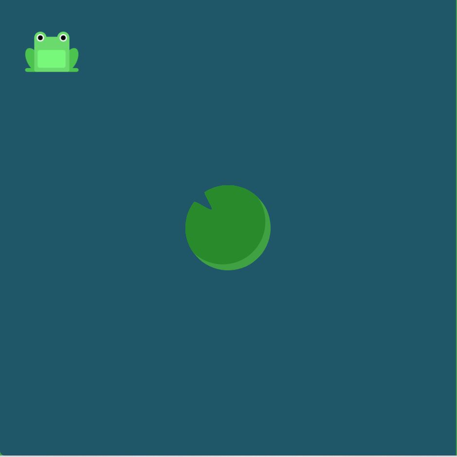
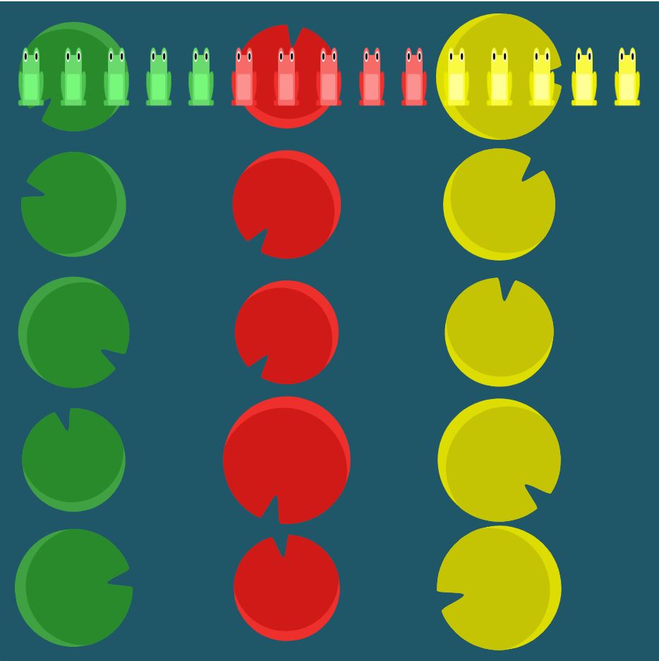
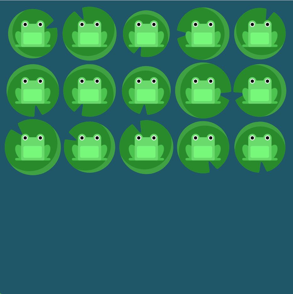
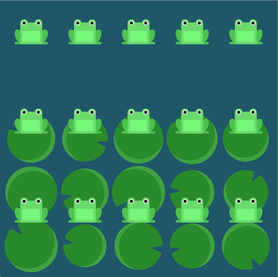
flex-direction
Elements
- row: Items are placed the same as the text direction.
- row-reverse: Items are placed opposite to the text direction.
- column: Items are placed top to bottom.
- column-reverse: Items are placed bottom to top.
Solutions
#pond {
  display: flex;
  flex-direction: row-reverse;
}

#pond {
  display: flex;
  flex-direction: column;
}

#pond {
  display: flex;
  flex-direction: row-reverse;
  justify-content: flex-end;
}

#pond {
  display: flex;
  flex-direction: column;
  justify-content: flex-end;
}
#pond {
  display: flex;
  flex-direction: column-reverse;
  justify-content: space-between;
}
#pond {
  display: flex;
  flex-direction: row-reverse;
  justify-content: center;
  align-items: flex-end;
}
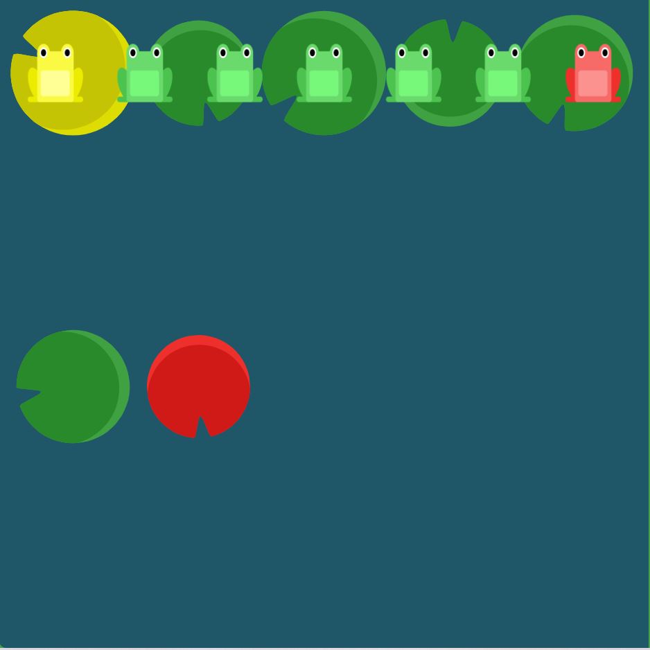
order
Elements
- By default, items have a value of 0, but we can use this property to also set it to a positive or negative integer value (-2, -1, 0, 1, 2).
Solutions
#pond {
  display: flex;
}

.yellow {
  order: 3;
}

#pond {
  display: flex;
}

.red {
  order: -1;
}

align-self
Elements
- This property accepts the same values as align-items and its value for the specific item.
### Solutions
#pond {
  display: flex;
  align-items: flex-start;
}

.yellow {
  align-self: flex-end;
}
#pond {
  display: flex;
  align-items: flex-start;
}

.yellow {
  order: 1;
  align-self: flex-end;
}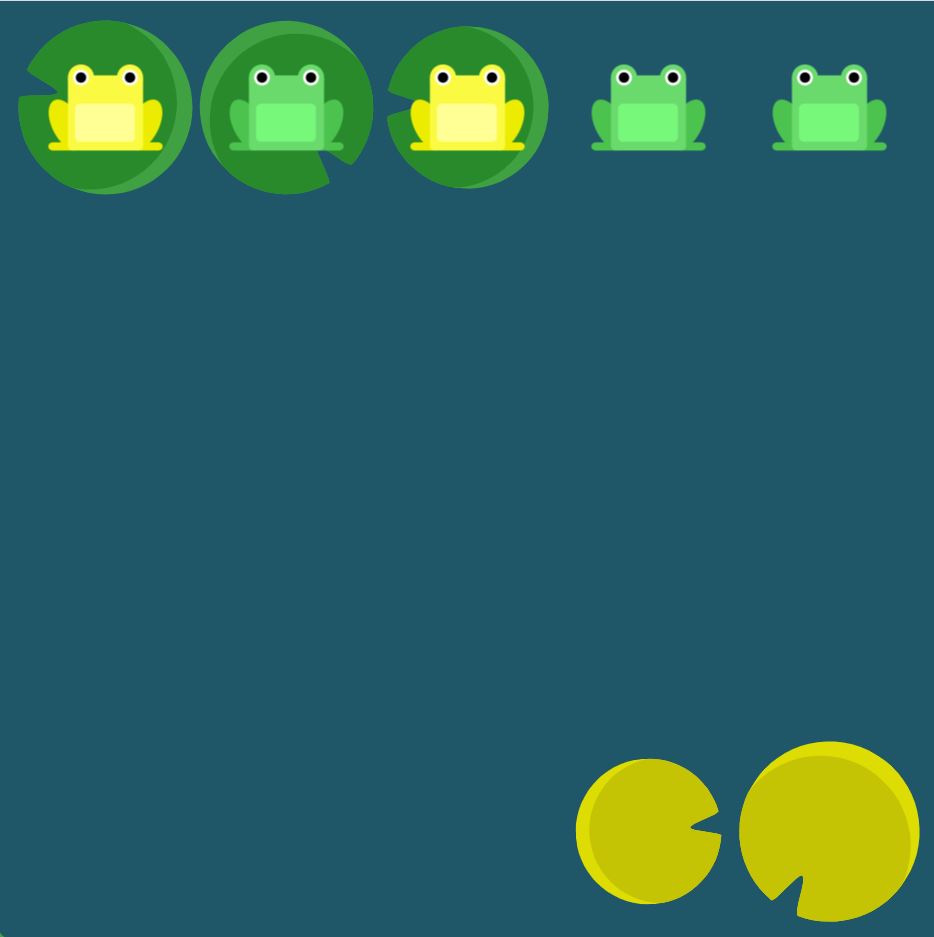

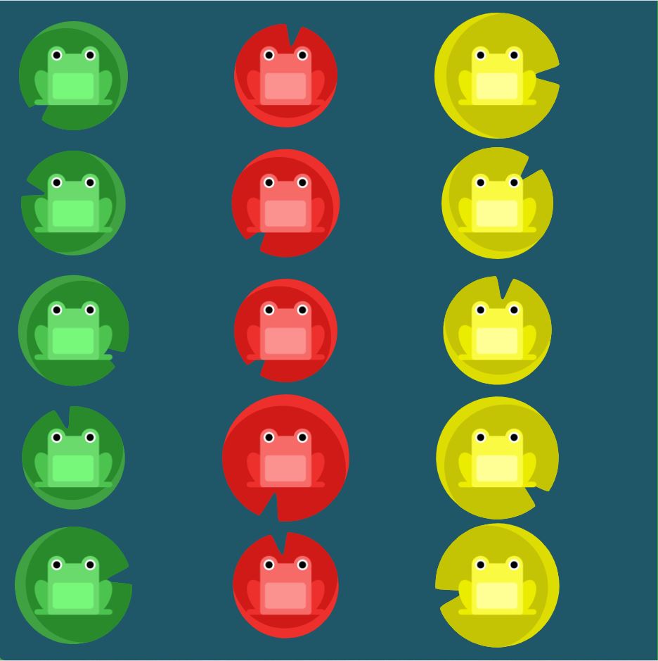
flex-wrap
Elements
- nowrap: Every item is fit to a single line.
- wrap: Items wrap around to additional lines.
- wrap-reverse: Items wrap around to additional lines in reverse.
Solutions
#pond {
  display: flex;
  flex-wrap: wrap;
}
#pond {
  display: flex;
  flex-direction: column;
  flex-wrap: wrap;
}
flex-flow
Elements
- The two properties flex-direction and flex-wrap are used so often together that the shorthand property flex-flow was created to combine them. This shorthand property accepts the value of the two properties separated by a space.
- For example, you can use flex-flow: row wrap to set rows and wrap them.
Solutions
#pond {
  display: flex;
  flex-flow: column wrap;
}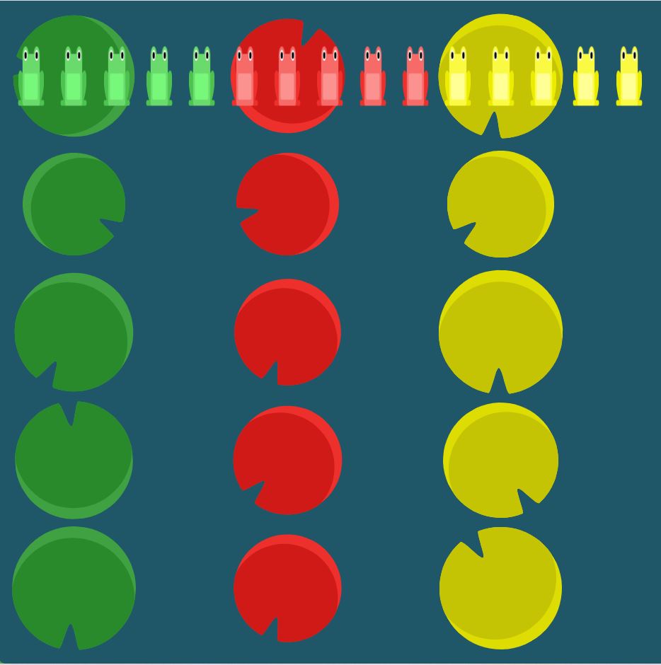
align-content
Elements
- flex-start: Lines are packed at the top of the container.
- flex-end: Lines are packed at the bottom of the container.
- center: Lines are packed at the vertical center of the container.
- space-between: Lines display with equal spacing between them.
- space-around: Lines display with equal spacing around them.
- stretch: Lines are stretched to fit the container.
Solutions
#pond {
  display: flex;
  flex-wrap: wrap;
  align-content: flex-start;
}
#pond {
  display: flex;
  flex-wrap: wrap;
align-content: flex-end;
}

#pond {
  display: flex;
  flex-wrap: wrap;
  flex-direction: column-reverse;
  align-content: center;
}

#pond {
  display: flex;
  flex-flow: column-reverse wrap-reverse;
  justify-content: center;
  align-content: space-between;
}